2011年3月27日 星期日

Project 1C - Cabin design - Final Design


Although the idea of final cabin design is refined from the initial concept, there are huge differences between the two designs, as the initial design failed completely.


The initial has failed due to the following reasons
-         the scale of the plans are not précised enough, problem with scaling the furniture and rooms
-         the position and allocation of the spaces and rooms are not connected with the surroundings (i.e. a 
          house is designed without considering its relationship with the surroundings)
-         no enough drawings to present one’s ideas

By improving the above presentations, a new design is born. The design intent stays the same, as shown below.


Initial Design concepts
-         “space move to users, not users move to the space “
-         should be constructed with natural materials
-         to design a house which suits the users’ styles and requirements
-         the windows and doors should become mobile elements as what the exemplar did, therefore they can be arranged to create different spaces which serve different functions (e.g. dining room and living as one, bedroom and working space as one )
-         a space should be able to develop into several smaller spaces, which can also be joined to create a single space (similarity as mentioned in the previous point
-         Should be able to blended into the surrounding
-         Should be able to maximise the desired views from the park


Final design

The stair case connected to the entrance of the cabin is situated in the north on the site, leading the users passing through the greenland of park and entering the house embedded in nature. 

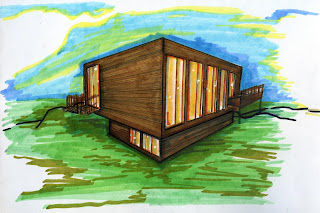
The house is designed in two levels, with public area (entrance, kitchen, dining etc.) on the second level, private areas (bedroom, bathroom and working area) on the first level. A balcony is situated in the first floor with a reflecting room located on it. This enables the users to enjoy the views and relax in natural breezes.

The exterior form of the dwelling is in the similar style of the original exemplar – Gary Chang. In order to create the essential elements of “mobile spatial arrangement “, folding doors and folding windows have been incorporated into the design – to separate a space into several spaces with different functions (e.g. bedroom and working area), converting one room with a certain function to another room with different function (e.g. living room to dining room), or lastly, to combine different small spaces into a huge space (e.g. combine bedroom and working space together).
Furthermore, the mobile door and window panels allow the users to maximise the effect of cross-ventilation, as well as the surrounding views.

As the result of the design intents, it can be seen that the cabin has reflected the philosophy of the exemplar’s design – suitcase house, as well as the desired requirements of rooms and spaces. Once again, the question of boundaries between public and private has thrown to the users again.

Diagrams and technical drawings

                                                                                 
Three dimensional exterior

Interior layout - timber furnishings


Site plan with cabin (from top) (1:200)

Site plan with cabin entrance -level (1:200)


Cabin northern elevation (1:50)

Cabin plan (second level)  (1:50)


Cabin plan (first level) (1:500)

Cabin southern section (1:50)

Ventilation diagram (second level)


Ventilation diagram (first level)

Views see from cabin (second floor)

Views see from cabin (first level)


Private and public space analysis (second floor)


Private and public space analysis (first floor)


2011年3月25日 星期五

Project 1C - First approach of Cabin Design

Several diagrams and drawings have been done in order to analyse the relationship between room requirements, overall area requirements, as well as the exemplar style.

Design processes diagrams (space relationship diagrams)


Private and public space analysis


Design ideas


Calculations for essential room areas

Rough plans (not inscale)


Initial Design concepts
-         “space move to users, not users move to the space “
-         should be constructed with natural materials
-         to design a house which suits the users’ styles and requirements
-         the windows and doors should become mobile elements as what the exemplar did, therefore they can be arranged to create different spaces which serve different functions (e.g. dining room and living as one, bedroom and working space as one )
-         a space should be able to develop into several smaller spaces, which can also be joined to create a single space (similarity as mentioned in the previous point
-         Should be able to blended into the surrounding
-         Should be able to maximise the desired views from the park

2011年3月19日 星期六

Project 1B - Exemplar analysis diagrams

These drawings have been done to further analyse the relationship between private spaces and public spaces. They are also used to indicate the functions of the rooms.


Functions of the rooms


Private and public areas


Room relationship diagrams

2011年3月18日 星期五

Project 1C - Site analysis

Site analysis

The site for the project is located in Kelvin Grove Urban Village. Due to the restrictions on setbacks in different dimensions, it turns out to be a long and narrow site, which is shown below.

Site plan (1:200)

The area coloured with red indicates where the cabin can be constructed. The diagram does not show ant contour line, as the ground is assumed to be completely flat(no gradient). The drawing is in the scale of 1:200. 

According to the plan, several diagrams for site analysis have been done in order to gain a better understanding of the  surrounding as well as providing a direction of cabin design.


!. Vegetations


Site analysis diagram (vegetations)

The colours of different green is applied to indicate the nearby vegetations to the site. 

The site is embedded in green. Not only located on lawn, it is also surrounded by vegetations. These create a refreshed natural scenery, which might become a valued and favourable view for the users. Although some of the vegetations might hide the user’s sight, they are also there to block the pedestrians/ passing car’s eye sights. The trees are also good sources for shading the future cabin.  


2. Pedestrians Movement and traffic movement

The colour of brown has been applied to show the circulation of pedestrians through the space

Site analysis diagram (pedestrians movement)

There were no much pedestrians out during the afternoon time. It can be seen that the small paths beside the area are used to travel around the site: either go across to the opposite road or leave the space and travel to another one. Some pedestrians stepped on the lawn straight away instead of paths.

On the other hand, the next diagram indicates the movement of traffic flow (cars), as shown below:

Site analysis diagram (traffic movement)


3. Views (of the people from surrounding to the site)

Site analysis diagram (views see from surrounding people)

The black arrows indicate the part of the site/cabin that the pedestrians or passing cars will be able to view. The big arrows indicate the “constant viewers to the site”, this means that these viewers will always be there, such as the people from High rise building and neibourhood), while the small arrows represent the sight from the “temporary viewers to the site” (e.g. pedestrians and passing cars). The diagram can also be seen as an indicator of cabin’s privacy level.


4. Views (of the users in cabin to outside)

Site analysis diagram (hierarchy of views from users of cabin)

The diagram indicates a hierarchy of views of the users in cabin. As the High rise building is situated in the west, and the neibours are situated on the south sides from the site, it can be seen that only north (Kulgun Park) and east direction will generate the desired views of nature.


5. Noise level

Site analysis diagram (noise level)

Although the site is surrounded by vegetations, it is located besides
Victoria Park Street
and neibour area. Small level of noises are created by cars and pedestrians, whereas the High rise building situated in west has produced a high level of distractive sounds as the building is under construction.


6. Sun path diagram

The following diagrams represent the difference of sun paths in summer and winter, as summer sun is in a higher angle and the winter sun is in a flatter angle, which means that the passive sunlight will be less effective during the time.

Site analysis diagram (summer sun path)


Site analysis diagram (winter sun path)


7. Wind direction/Ventilation

As the majority of Brisbane winds blows from the direction south, it will be critical that the cabin’s openings will be constructed on north and east facades in order to maximise the efficiency of ventilation.

Site analysis diagram (wind direction/ventilation)


2011年3月15日 星期二

Project 1B - Exemplar analysis - Suitcase House


Suitcase house is located in the Great Wall of Beijing. It is designed by Gary Chang for Edge Design in Hong Kong. The design intent of this dwelling is to rethink the nature of intimacy, privacy, spontaneity and flexibility. Suitcase house challenges the stereotype of what a living space should be, as the designer tried to design "a space move to and reflect the users, not a space which users move to".

The space in the house can be arranged to multiple scenarios, depend on the users' desire and requirements (this will be mentioned further in throughout the text). It is a house adapts totally to the activities which will be taken in the space.
The exterior skin of the building is wrapped by double glazing folding doors in full height, while the interior is composed by a series of screens which forms a matrix of openings.

Building as an ENVIRONMENT FILTER

The house is built totally from local materials, which include timber, and a steel inner framework supporting the structure. The applications of materials on the facades have created a visual effect – which blurred the boundaries of nature and dwelling, as well as outside environment and inside space.

Suitcase house is positioned in north-south in order to maximise solar exposure. Air ventilation can also be maximized by moving the sliding doors and windows. Due to the above reasons, the house will be energy efficiency and comfortable during all seasons.

Exterior of Suitcase house


Building as a CONTAINER OF HUMAN ACTIVITY

As mentioned before, the dwelling is highly adaptable and is able to meet various users’ desires, according to the activities performed in the space. This can be done simply by sliding the mobile elements such as sliding windows and sliding doors.

The design of the dwelling is based on three layers of strata – the top stratum is the ceiling level, the middle stratum is the major space where allows the users to create their desired space by moving the elements, and the bottom level of the stratum is reserved and fixed for services such as maid’s quarters and services. It can be seen that the house is really a container of human activities adapting to people’s requirements.

Floor panel


Interior space (middle level)


Building as a DELIGHTFUL EXPERIENCE

Suitcase House brings special experiences to users of arranging one’s desire spaces as it requires strong engagement of achieving one’s goal.
The house is also provided with several entrances which equal status. This means that each entrances will lead to a brand new and re-reading of the spatial organization.

Furthermore, the position of the house has maximized user’s views to the prominent Great Wall. Users will be able to enjoy the views from all major parts of the house. The free roof level can also be assessed by using the free pull-down stair case below.

It can be seen that the relationship and interaction between users and spaces can be explored in depth by living in the Suitcase house.  

Mobile element (sliding door)

Free pull-down staircase


Technical Drawings (mainly in 1:200)

Site Plan

Plan (1:200)

Sections (1:200)

Longitude sections  (1:200)

Elevations (1:200)

Isometric
 (photos are from 
 http://www.pushpullbar.com/forums/showthread.php?2136-Beijing-Suitcase-House-Gary-Chang-%28EdgeHK%29, other information sources will be in the reference list)